OSX Not Colour Calibrated
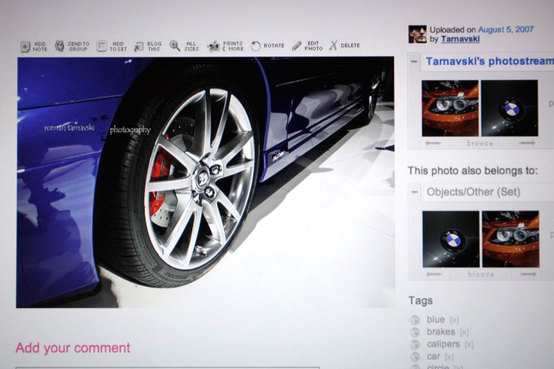
It seems that Apple left one thing out of the equation for Safari 3.1 - colour adherence. With my new Dell 2408WFP, I was getting quite stroppy - as no matter how many times I would calibrate it - it would continually not show the correct colours as compared to my MacBook Pro screen [matte] - or so it seemed. I initially posted two photos on DPreview hoping to ascertain some unknown out of the crown. Here is the MacBook Pro screen with the ‘correct’ colour.
MacBook Pro
Dell 2408WFP
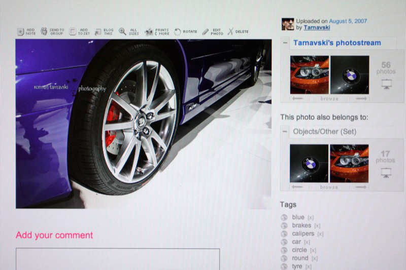
You can evidently see that the Dell shows a purple instead of a blue. Very disappointed was I to think that a screen on which I just dropped some hard earned, can’t even display “BLUE”!
and then..
I just thought I would open it up the images in Firefox - just to check.. and voila
Unfortunately after a few more tests like the above - it seems across OSX is the same thing - ie. Finder when displaying the above photos - merely shows it in shades of purple as well.Now the only reason I even came across the fact that it could be an application specific error - is when I look at the photo in Lightroom 1.4, depending on which screen I have the image on - it changes the colours to suit the screen. So my question is - if Lightroom can do it - why can’t OSX?
Update
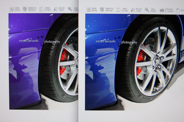
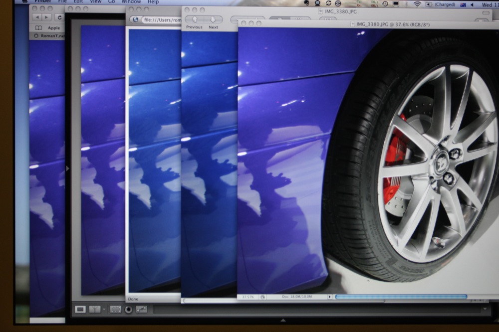
After re-calibrating both monitors with the Gretag Macbeth i1 Display 2, I have composed some windows together to show the difference between different applications and their adherence to the needed colour management.
The applications I used for this test, and in this specific order are:
- Safari3.1 (5525.13)
- Lightroom 1.4
- Firefox 3.0b4
- Preview 4.1 (469.2.1)
- Photoshop CS3
Dell 2408WFP
The peculiar thing about the Dell, is that Lightroom actually showed a very strong purple instead of blue, and then after about a minute - without me physically interacting with the computer - it simply changed to the correct colour. Which is depicted in the shot above.
MacBook Pro
Analysis
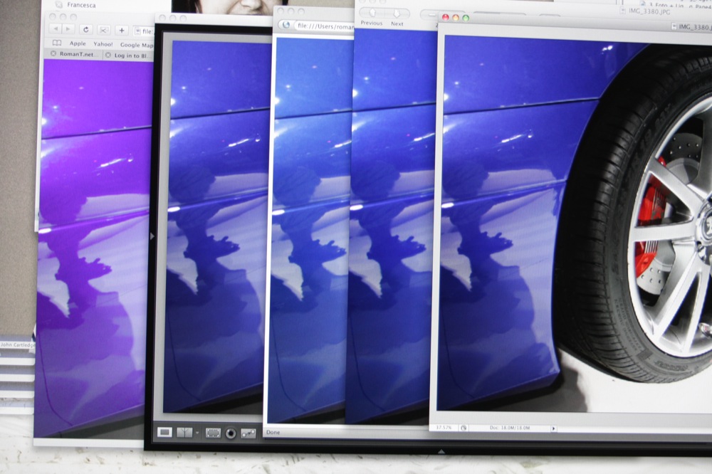
It seems that in the initial shot with the 2408WFP, Safari obviously does the worst, showing a blatantly purple where there should be blue. Other applications vary slightly in the shades of blue, but otherwise display a fairly closely matched colour.
When it comes to the MBP to display the same set of images, Safari, Lightroom, and Photoshop - all display a shade of purple instead of blue.
The annoying part is that whilst writing this - if leaving the specific application on either screen - it adopts the correct colour profile, and displays the correct colour.
As such - I have no choice but to personally conclude that it seems that OSX isn’t informing the application that it has been moved to another screen in a timely manner.
There have been reports that the Dell uses a new backlighting system that the i1 is finding difficult to actually meter, yet to me it seems there’s more software problems at play here under the bonnet of OS more than anything else.